Get ready to see the National Home Show in a whole new light—because Tiffany Pratt is at the helm as its new Creative Director! Known for her fearless use of colour, playful design sensibility, and knack for turning spaces into experiences, Tiffany isn’t just curating a trade show—she’s designing a feeling. From bold stripes inspired by the iconic Princes’ Gates to hand-painted touches that bridge the show’s rich history with today’s vibrant energy, her vision is equal parts nostalgic, whimsical, and utterly contemporary. Step inside her world, where every hue has a heartbeat, every corner sparks connection, and every detail invites you to play, explore, and be inspired. The glow up is here—and it’s brilliant.
The National Home Show, presented by REMAX, returns to the Enercare Centre, Exhibition Place from March 6–15
Instagram: @homeshowto | Facebook: HomeShowsTO | nationalhomeshow.com
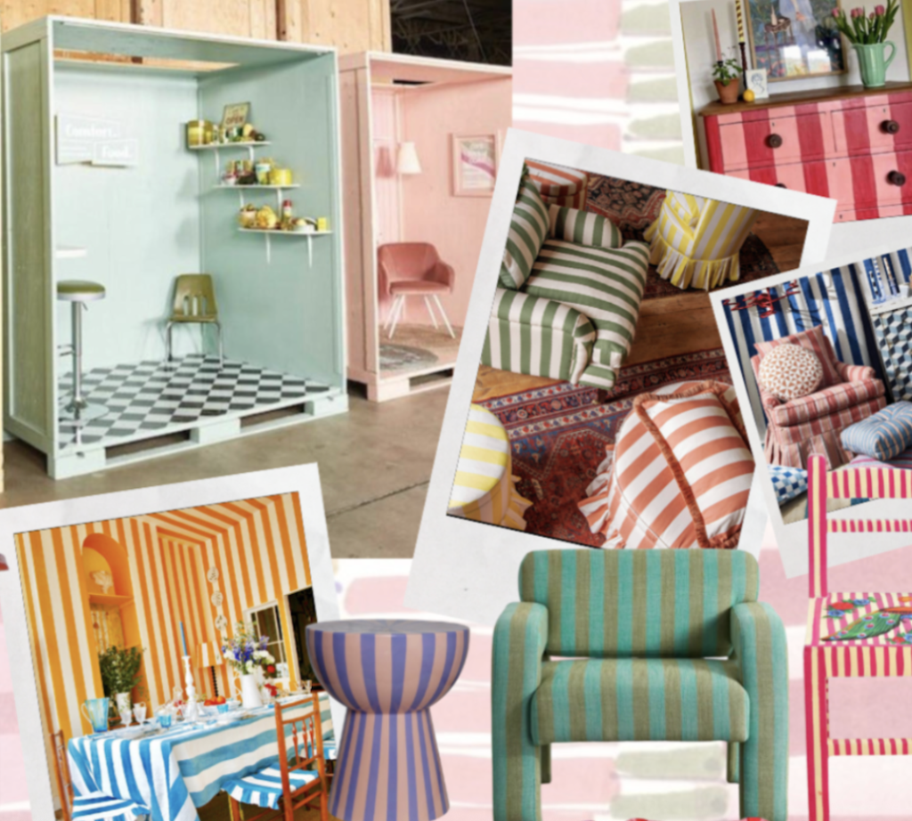
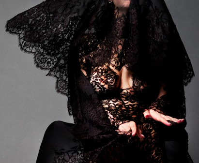
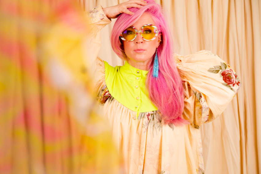
Photo provided by Centric PR
As the new Creative Director of the National Home Show, what was your very first decision in shaping its glow up?
My very first decision was this: we are not designing a trade show-we are designing a feeling.
Before choosing a single material, I defined the emotional palette. This year’s feature colours-a pink-red tulip, electric chartreuse, and a saturated teal blue-became our heartbeat. They’re optimistic, punchy, and confident.
From there, every decision followed that energy. We shifted to handmade-feeling environments inspired by bold STRIPES, and the playful irreverence of the bag charm trend, those small personal touches that transform something standard into something expressive.
The stripes themselves were inspired by the new Princes’ Gates logo-its strong vertical rhythm and graphic geometry. We translated that into architectural striping moments throughout the show to create movement, repetition, and visual optimism.
And one of my most meaningful interventions was honouring the show’s legacy. I hand-painted directly onto archival black-and-white Home Show photographs -layering today’s colour over yesterday’s history. It was my way of saying: this show has always been here. We’re not replacing the past. We’re illuminating it.
The glow up wasn’t about more. It was about meaning.
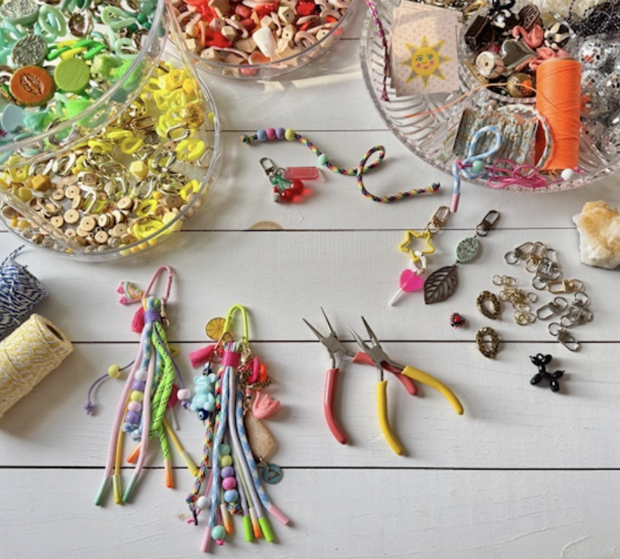
Photo provided by Centric PR
How do you use colour to intentionally change the mood of a space?
Colour is emotional architecture.
A pink-red tulip tone activates warmth and connection. Chartreuse sparks forward motion and creativity. Teal blue grounds everything with depth and confidence. When layered together, they create rhythm and contrast-like stripes in motion.
Even painting over historic black-and-white photography changed the emotional temperature of the space. It symbolized continuity. It brought warmth to memory. Colour doesn’t erase, it truly energizes.
Your designs nod to history while feeling fresh—especially with inspiration from the Princes’ Gates. How do you keep nostalgia from feeling dated?
Nostalgia becomes dated when it’s copied. It becomes powerful when it’s translated.
The Princes’ Gates have this Art Deco optimism-symmetry, strength, and verticality. The new logo distilled that into bold graphic form, and we expanded it architecturally through striping and repetition across the show floor.
By hand-painting over historic Home Show imagery, we created a literal bridge between eras. History wasn’t behind glass, it was part of the present moment.
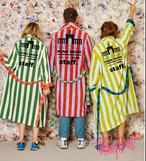
Photo provided by Centric PR
The show feels more like a home than a trade floor—why was emotional, playful design so important to you this year?
Because home is emotional and history is emotional too.
The handmade details, visible brush strokes, stripes, layered textures-they soften the space. They make it feel human. Not corporate. Not cold.
Play creates memory. Memory creates connection. And connection is what makes a show feel like home.
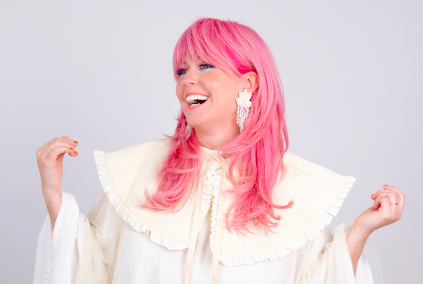
Photo provided by Centric PR
When guests leave the show, what feeling do you hope colour helped unlock for them at home?
Permission.
Permission to mix eras. Permission to paint over the old and make it new again. Permission to trust their instincts. Permission to be bold.
If colour unlocks courage, then we’ve done our job.
Where can we find you at the home show and virtually?
I’ll be at the show on opening day, March 6th, and at the Sherwin-Williams booth that day offering custom colour consultations and creating personalized fan decks for guests.
I’ll also be on the main stage on March 8th at noon for International Women’s Day, discussing Colour Confidence and how to paint your world back to life.
Virtually, you can find me at: Instagram: @thetiffanypratt | Website: www.tiffanypratt.com