Picture a place where skyscrapers and palm trees meet… From a sunset surf on the beaches of Malibu to a skate under the bright lights of New York City in the sticky summer heat, that’s where T.O.N.Y Apparel founder and creative director James Elmhirst aims to take you with his collection of gender-neutral, sherbert-coloured separates.
T.O.N.Y stands for Toronto and New York, two cities from which Elmhirst draws much of his inspiration. His love of cityscapes and architecture inform the balance of streetwear elements and luxe details in his raw silk silhouettes, which are hand-finished with vintage wooden buttons.

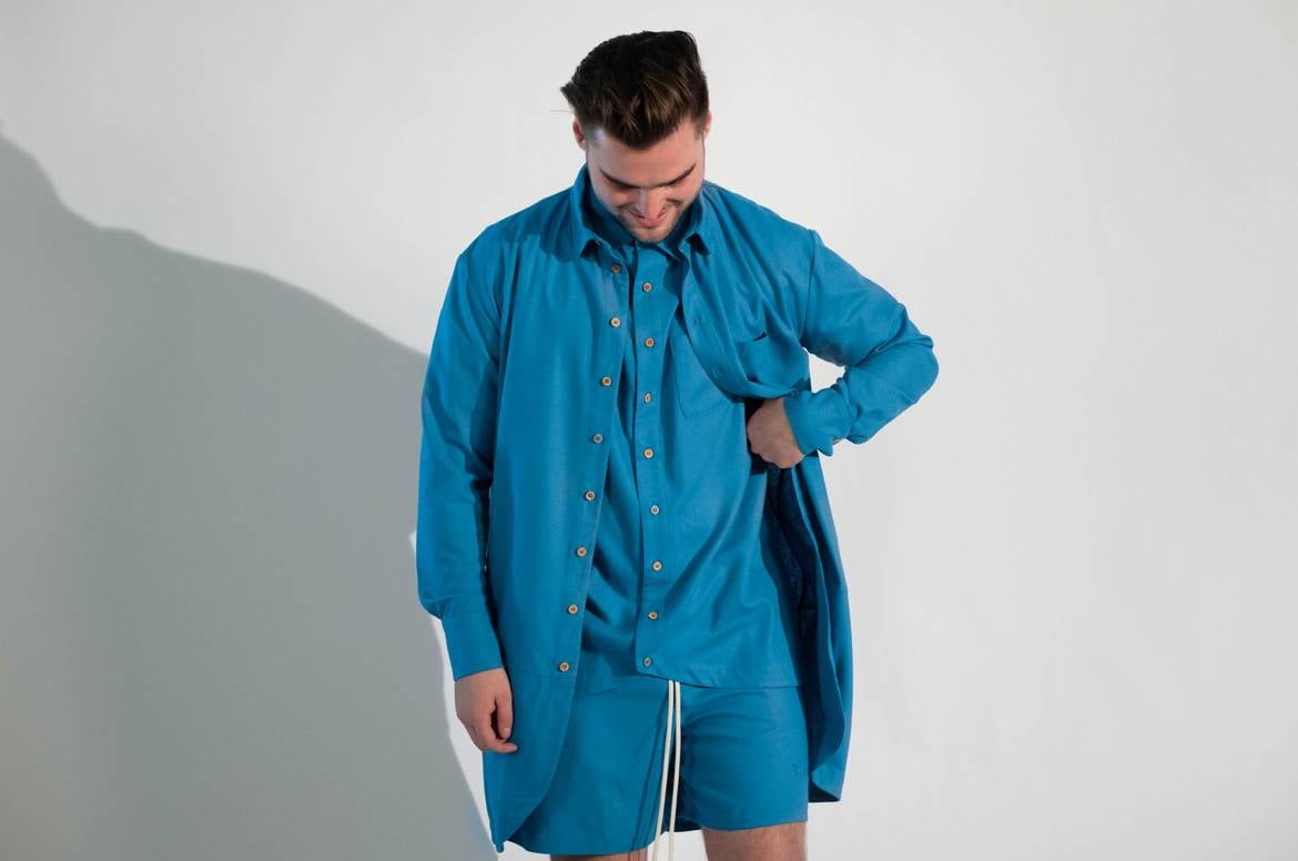
T.O.N.Y Apparel Founder and Creative Director James Elmhirst wearing his own Dear Summer collection in Blue
Elmhirst studied business and marketing after high school, but throughout his years at Ryerson University, he became an intern and understudy to both Sally Lapointe in NYC and Nikki Yassemi in Toronto. With no formal training specific to fashion design, Elmhirst credits his understanding of garments and construction to these experiences and those he gained living in two of the most diverse cities in the world.
Through the T.O.N.Y Initiative, a pledge from Elmhirst to donate a portion of the brand’s sales from each collection to a different charity, T.O.N.Y will donate all proceeds from Dear Summer – his first official drop – to the Fred Victor Organization, a charitable organization that continues to create long-lasting change for low-income and homeless individuals living in Toronto during the pandemic.
In Elmhirst’s exclusive interview with Digital Editor Anastasia Barbuzzi below, he discusses T.O.N.Y Apparel‘s cheery colour palette, stress-free dressing, his inspiration for Dear Summer, and so much more.

The T.O.N.Y Apparel Dear Summer colour palette
AB: We love the four colours you chose for your first collection. What inspired your choices for Spring/Summer?
JE: When I conceptualized the collection it was in the middle of the first lockdown, and summer was fast-approaching. I wasn’t able to go anywhere and like most people I was stuck inside my Toronto apartment. What inspired the colours and got me through that first lockdown were the walks and rollerblading I did around Toronto with my girlfriend and on my own.
Even though the city wasn’t looming with events as most summers have, I felt a sense of lively energy from Torontonians eager to feel connected again. With this in mind, I chose colours that I felt captured the vibes and energy around Toronto during that time; from the glistening blue lakeshore, to vibrant street art, and blooming nature from places like High Park and Queen West.
Everything feels much more vibrant and colourful in the summer, so I really wanted to encapsulate that energy and vibe within the colour palette. My mood is also very influenced by the colour palette; these bright summer colours brought out the happiness in me during lockdown. I wanted to honour that joy and share that with others, hoping it would resonate with them when viewing the collection.
AB: There’s a unisex appeal to your designs… Did you tailor the pieces in your collection with this in mind? How?
JE: I did tailor the pieces with a unisex appeal in mind. When designing the collection I envisioned both men and women wearing the garments. I think fashion has become so versatile and inclusive. People aren’t afraid to express themselves whether it be with a certain style, a woman wearing clothes that were made predominantly for men, or vice versa. You see so many people mix-matching and cross-dressing, and I’m a huge supporter of this. Inclusivity is a key component in designing for me. I always want others to feel welcome and comfortable wearing a T.O.N.Y piece; no matter their race, gender or identity as a whole.
I wanted to design pieces that could be very versatile and styled in many different ways so anyone could wear them. I also ensured the silhouettes were very neutral and slightly oversized, so they would drape really well on different bodies, regardless of gender or body type. I believe fashion is about personal taste and expression, so having a garment that can be styled and worn to match individual tastes is very important. When you make silhouettes too complicated and specific it takes away from the consumers personal style.

The T.O.N.Y Apparel Dear Summer Silk SS Shirt and matching City Shorts in Coral
AB: Matching separates (recently coined “co-ords” and “sets”) seem to be very much a part of the WFH uniform these days, and for the summer, T.O.N.Y pieces offer a lighter alternative. Did you have this trend in mind when designing?
JE: To answer this question, I have to mention my first real fashion position; interning with Sally Lapointe in NYC. Before this experience I never had industry or design experience; including knowledge of design processes or even attending fashion school. Sally is very much known for her monochromatic collections and in watching her process and collections come to life, it greatly inspired and developed my love for monochromatic sets as well. When I began designing the Dear Summer collection, I definitely had that in mind.
I think the monochromatic trend has become especially popular during the pandemic because it’s so much easier to put outfits together when the pieces match. With people working from home, there’s definitely been a lack of motivation to choose outfits and know what colours/designs work well together. On the other hand, throwing a matching set on is easy, comfortable, and stylish. Not to mention, co-ords are a quick put together look, so if you have to go out you’re ready haha!
I also wanted to offer lighter, more playful options in terms of colour. Lately I’ve been seeing an abundance of tracksuits and matching sets in earthy, neutral colours, which I feel becomes repetitive and slightly boring. Offering others the option to wear a matching set full of colour and vibrance may even lift the confidence and spirits of others during these trying times. I’d love for my clothes to be that light for people.
AB: Why do you think wearing matching separates has become so trendy? Do you think it makes dressing easier, especially for men?
JE: I believe monochromatic pieces have risen in popularity due to the ease of pressure and thought they create when choosing an outfit. Co-ords also look very clean and chic, making for a simple solution to those at war with their closet choices. Though I do love mixing and matching colours, some days it just doesn’t work out. So having the option to quickly throw on a matching set makes the process of choosing an outfit simple, while remaining stylish. I’m sure matching sets also appeal to men wanting to experiment with fashion, but may not have the confidence to know where to start. I hope the co-ords in my collection can also be a non-intimidating way to introduce and encourage a lot of men to get out of their comfort zones and indulge in fashion as much as anyone else would.
AB: Can you speak to the versatility of each piece for people who may want to wear your City Shorts without the matching shirt?
JE: When I’m designing a collection I often think of what’s missing in my closet. In this case I had trouble finding a matching shirt and shorts set without a pattern. The lack of pattern and minimalistic design would make space for mix-matching with other garments, rather than having to wear the matching set together. This is why I designed each piece within the Dear Summer collection without patterns or graphics; the solid colours make the pieces much more versatile to wear with other outfits.
For example, you could pair the blue City Shorts with a pastel yellow rugby, or I often pair the peach Dear Summer Silk SS shirt with a pair of black jeans. In terms of the Beach Coat (My favourite piece from the collection), I wanted to design a blend between a cardigan and an oversized plaid shirt. I love wearing both of those garments but I wanted something with the length and monochromatic look of a long cardigan, and the style and silhouette of a plaid shirt. This concept makes the Beach Coat perfect for styling unbuttoned, over a hoodie, t-shirt, or buttoned up on its own, with a pair of jeans or track pants. Versatility was a key aspect of the design process for this collection. I understand that not everyone may want to wear the complete set together, so creating that option for endless styling possibilities is something I’m happy I achieved with these pieces.

The T.O.N.Y Apparel Dear Summer Beach Coat and matching City Shorts in Ivory
For more information on Fred Victor, how to get involved, or make a donation of your own, visit https://www.fredvictor.org/


