

Everywhere we look, colour surrounds us. Colour effects our decision and our way of living – affecting our mood, intuition, and quality of life.
Pantone is a company/system that was created to identify, communicate, and create consistency in colour across all mediums and industries. Each year since 2000, the company has released an official “colour of the year” that not only describes the trends of the upcoming year, but also the attitudes based on the societal cultural climate.
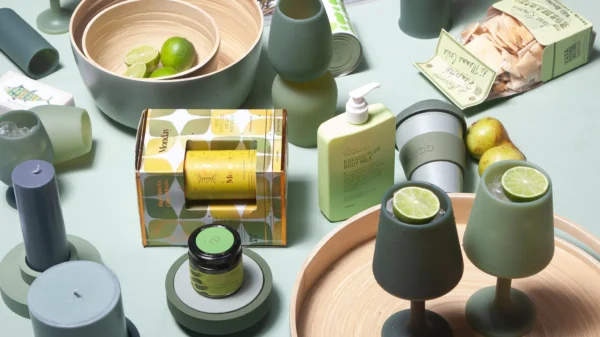
The colour of the year for 2017 is Greenery (Pantone 15-0343): an invigorating yellow-green shade mimicking the greenery of nature. The colour’s intention is to represent new beginnings, healthier trends in food and lifestyle, and the concept of environment. With hope being an important theme of 2017, Pantone describes the zesty colour as “bursting forth in 2017 to provide us with the hope we collectively yearn for amid a complex social and political landscape.”
As mother natures background, the bright colour is surprisingly neutral in both large and small doses. The fresh colour pushes design boundaries compared to colours traditionally crowned in past years. This bright step in a revitalizing direction is well represented of a year aspiring to change.
The reaction to the colour has been a little abrasive, many put off by the initial vivacity and brightness. But just because Greenery was named colour of the year, it doesn’t require everyone to redecorate his or her entire life in this hue. The colour is merely a symbol intended to represent and stimulate the attitudes of the globe. In a universe that is so dependant on connection, this colour reminds society the power of connecting not only with nature, but also with one-another.
Let this colour inspire you, guide you, and drive your personal pursuit of passion and vitality.


You must be logged in to post a comment Login